Best Practices for Reducing Cart Abandonment
Most abandoned carts are not lost sales. They are unanswered questions. A shopper who adds an item to a cart has already decided they want it, and something between that moment and the payment screen made them hesitate: a surprise cost, a required account, a form that felt endless, or a doubt about whether the store could be trusted. Long-running checkout research from the Baymard Institute puts the average abandonment rate at roughly seventy percent, which means about seven out of ten carts never turn into orders. The encouraging part is that most of the reasons are fixable, and fixing them costs far less than finding new customers.
Find the Leak Before You Fix Anything
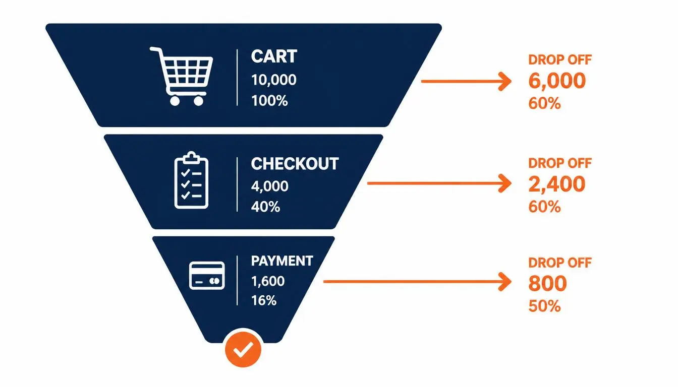
Before changing a single button, work out where shoppers are actually leaving, because two different problems hide behind the same term. Cart abandonment usually means someone added an item and left before starting checkout, often because they were browsing, comparing prices, or saving something for later. Checkout abandonment means they began paying and stopped somewhere along the way, most often at the shipping or payment step.
These two behaviors have different causes, so they need different fixes. Your store analytics should show which stage loses the most people. Start with that stage rather than trying to improve everything at once, since a fix aimed at the wrong step changes very little.
Show the Full Price Early
If there is a single finding repeated across nearly every study of the topic, it is that unexpected costs drive more abandonment than almost anything else. In large surveys, close to half of shoppers who left cited extra costs such as shipping, taxes, or fees appearing late in the process. The surprise itself does the damage, not necessarily the amount, because it feels like the store hid something.
The fix is transparency. Show shipping and tax estimates on the product page or in the cart, well before checkout. If you cannot give an exact figure, a realistic range is far better than silence. You can also cover shipping above a set order value, or build an average shipping cost into your product prices, so the total never jumps at the last step. Clear delivery windows belong in the same category, since slow or unclear delivery is another common reason people walk away.
Let People Check Out as Guests
Forced account creation is one of the most consistent causes of checkout abandonment, accounting for roughly a quarter of it across several studies. A shopper in a hurry rarely wants to invent a password just to buy one item, and many will simply leave rather than do it.
Make guest checkout the default, and invite the customer to save their details after the purchase is complete, when the friction no longer blocks the sale. There is a real trade off here, since stores often want accounts in order to send follow up emails. But asking for an email address at the start, without requiring a full account, can serve that goal while keeping the path to purchase short.
Shorten the Path to Payment
Every extra field, page, or decision gives a shopper another reason to leave. Usability research suggests an ideal checkout needs only around a dozen to fourteen form elements, while the average checkout flow contains closer to two dozen. Review your own checkout honestly and remove anything that is not strictly needed to ship the order.
A few structural choices help: a single page checkout or a clear progress indicator so people know how many steps remain, autofill support for addresses and payment details, and digital wallet options that let mobile shoppers pay with a single confirmation instead of typing card details on a small screen.
Build Trust at the Moment of Payment
Entering card details is the point where doubt is highest, so this is where trust signals matter most. Show recognizable payment options, make your secure payment setup visible, and keep your returns policy easy to find without leaving the checkout. Accepting several payment methods also matters, since some shoppers leave simply because their preferred option is not offered.
Contact details help too. A visible way to reach a real person, whether through a support email, a phone number, or a chat option, signals that there is an actual business behind the page, which quietly reduces the fear that stops many first time buyers.
Treat Speed and Mobile as Non Negotiable
Slow pages, error messages, and clunky mobile layouts all erode confidence right when a purchase is on the line. Many shoppers now buy from their phones, and abandonment tends to run higher on mobile, so testing your own checkout on a real phone, not just a desktop browser, often reveals problems you would otherwise never see. Buttons that are too small, fields that fight the keyboard, and pages that take several seconds to respond are all fixable once you know they exist.
Answer Questions Before They Become Exits
Hesitation often comes down to a missing piece of information: how does this fit, how long will it take, what if I need to return it? Address these questions where they arise rather than hoping shoppers will search for the answers. Strong product pages do a lot of this work automatically, which is why the approach in how to write product descriptions that actually convert pairs so naturally with checkout improvements, since both are about removing doubt before it becomes a reason to leave.
Live chat and clear help links can catch questions in the moment. Exit intent messages, the pop ups that appear as someone moves to leave, work best when they resolve a doubt, for example by clarifying shipping or returns, rather than immediately pushing a discount.
Recover the Shoppers Who Still Leave
Some shoppers will leave no matter how smooth your checkout is, and a well timed reminder brings a portion of them back. An abandoned cart email sent within roughly an hour, showing the items left behind with an easy link straight back to the cart, is the most common recovery tool. A short sequence of two or three messages, spaced out, generally works better than a single nudge.
Hold off on heavy discounts in the first message, since routinely offering money off teaches shoppers to abandon on purpose. Be careful about consent as well: only email people who agreed to hear from you, and follow the email marketing rules that apply where you and your customers are located. Recovery brings back a modest share of lost sales, which is exactly why prevention through a better checkout does more work than recovery ever can.
Test One Change at a Time
Once you have made improvements, resist the urge to change everything simultaneously. Testing one change at a time, whether that is a different shipping message or a shorter form, shows you what actually moved the numbers. If this is your first store, keep your expectations realistic, since progress is usually gradual, a point explored further in six things to know before starting your first online business.
Your First 30 Days: A Simple Action Plan
- Week one, audit. Check your analytics to find the stage where shoppers leave, then make a test purchase on your own phone and note every point of friction.
- Week two, fix the biggest blockers. Show full costs earlier and turn on guest checkout.
- Week three, reduce friction and add trust. Trim unnecessary form fields, add clear returns and contact information, and confirm the payment options you accept.
- Week four, set up recovery and measure. Create a short abandoned cart email sequence, then compare your numbers against week one to see what changed.
Working through these in order keeps the effort manageable and gives you evidence at each step, so every improvement builds on something you have already confirmed rather than a guess.